P&G WAYFINDING
ENVIRONMENTAL GRAPHIC DESIGN / PRINT
Proctor & Gamble is the largest Consumer Packaged Goods corporation. I worked as a Brand Expressions co-op for the Family Care Design team (Charmin, Bounty, & Puffs) during which I led an array of projects. Highlighted below, the Family Care building needed an accessible wayfinding system for new and current employees to navigate the building.
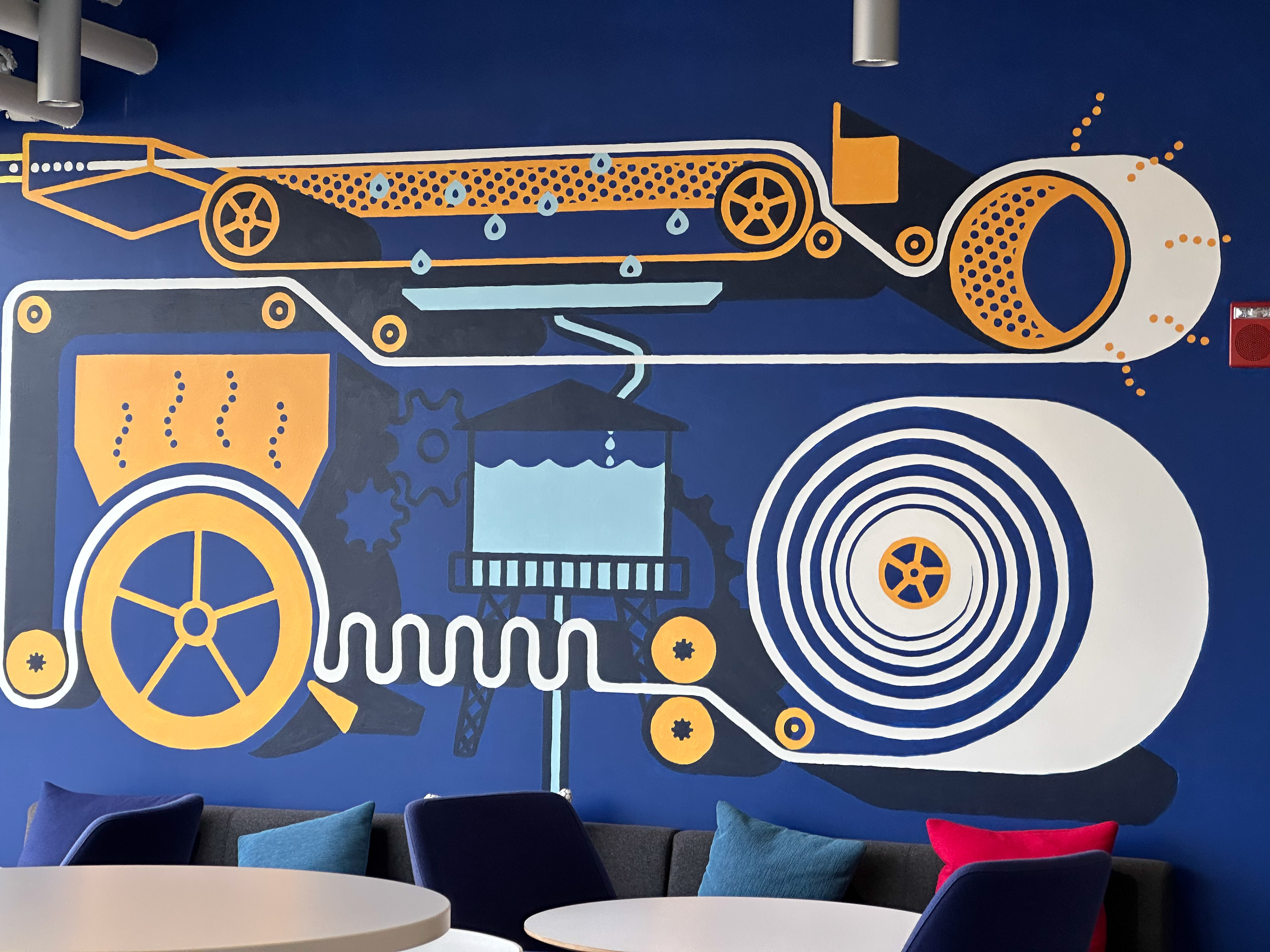
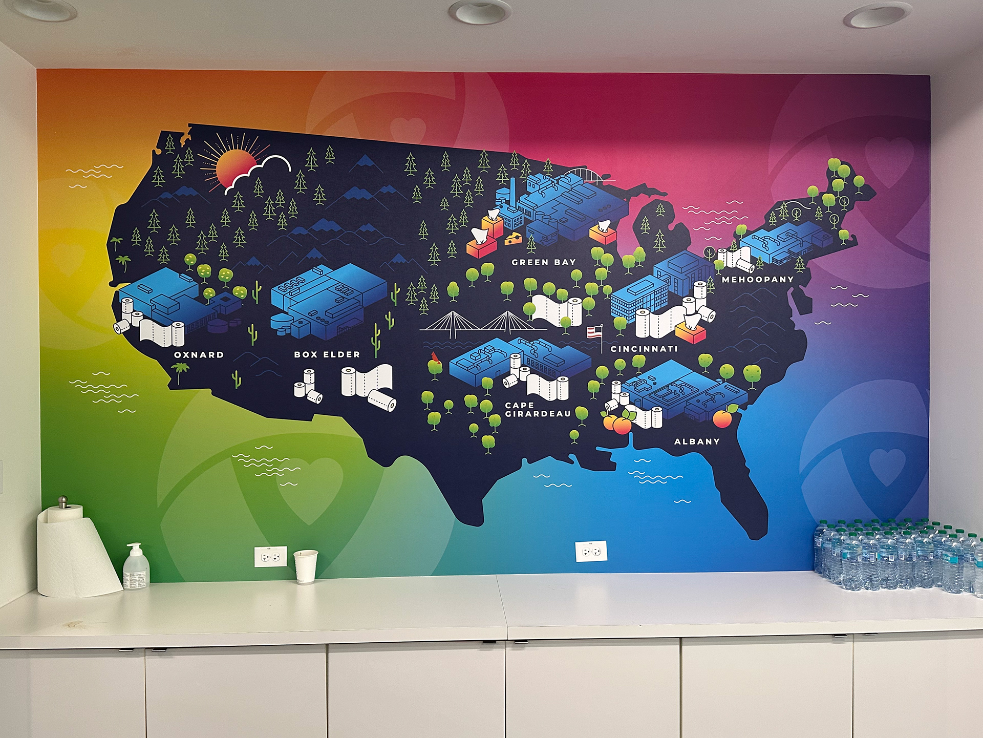
Family Care Design
The family care business unit has an array of branding, both corporate and the family care design systems. During my audit, I found it important to deeply examine both to determine what story they told and current hierarchal systems. What needed to be re-imagined and what could be respected?
Benchmarking
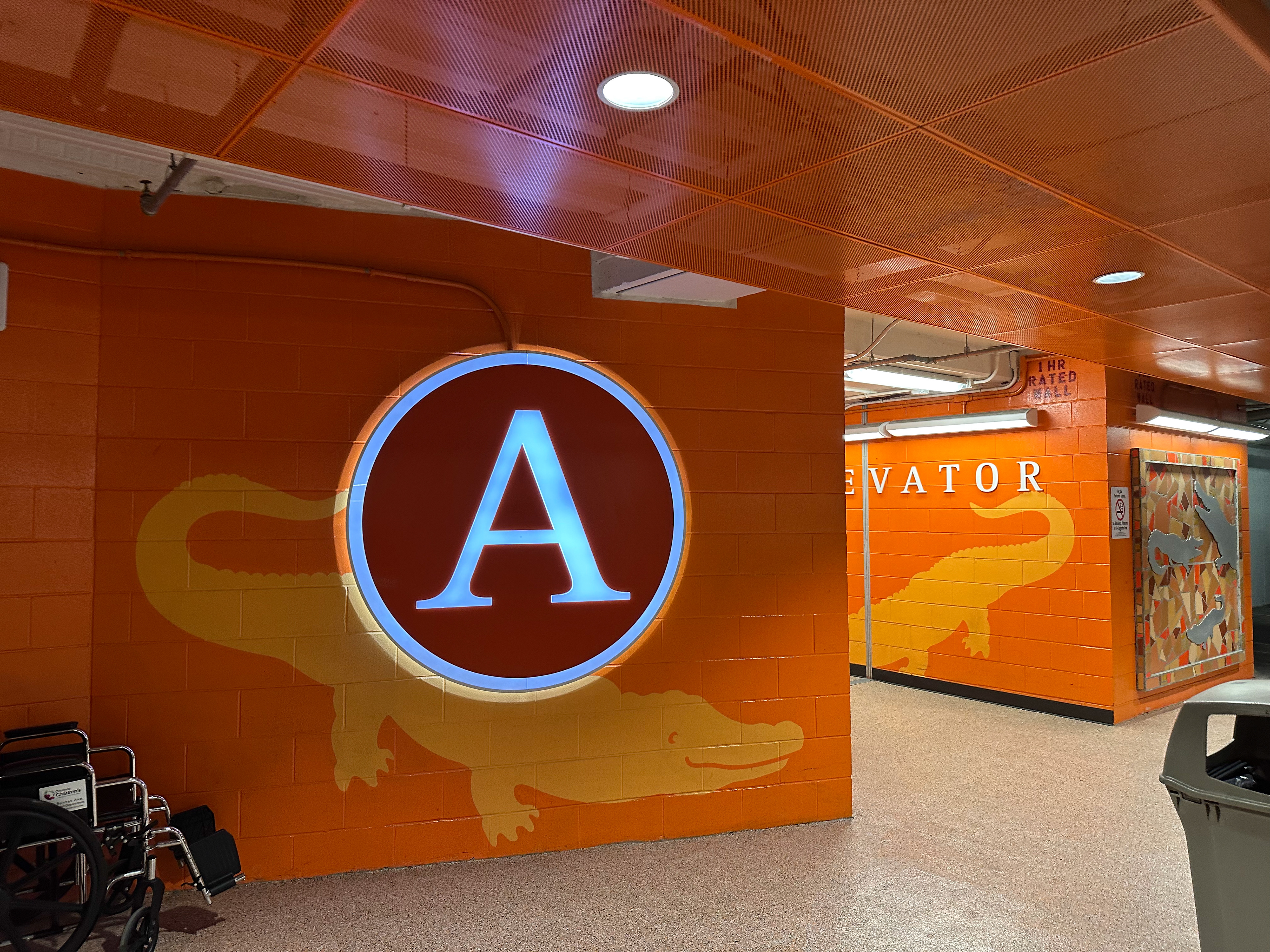
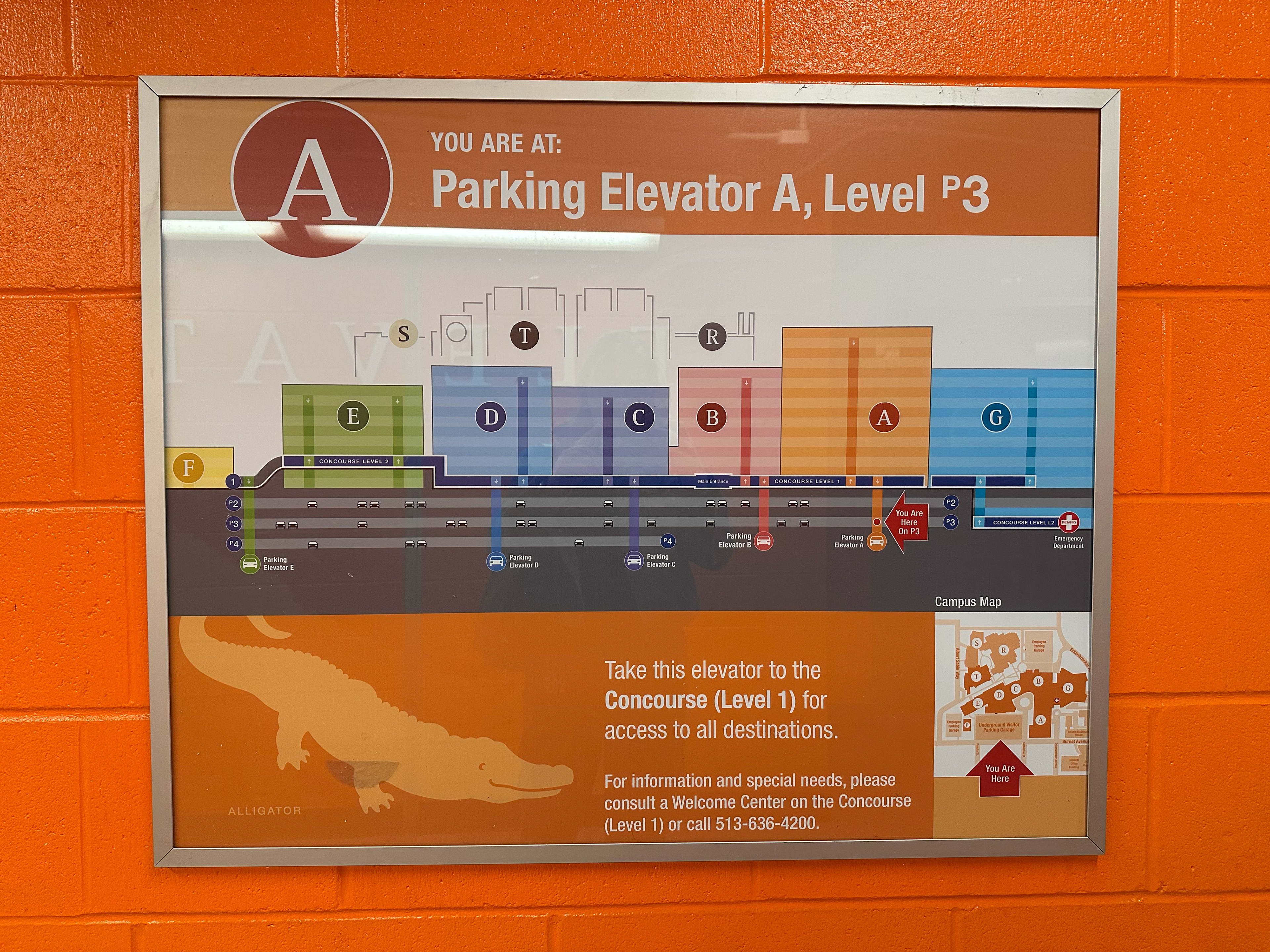
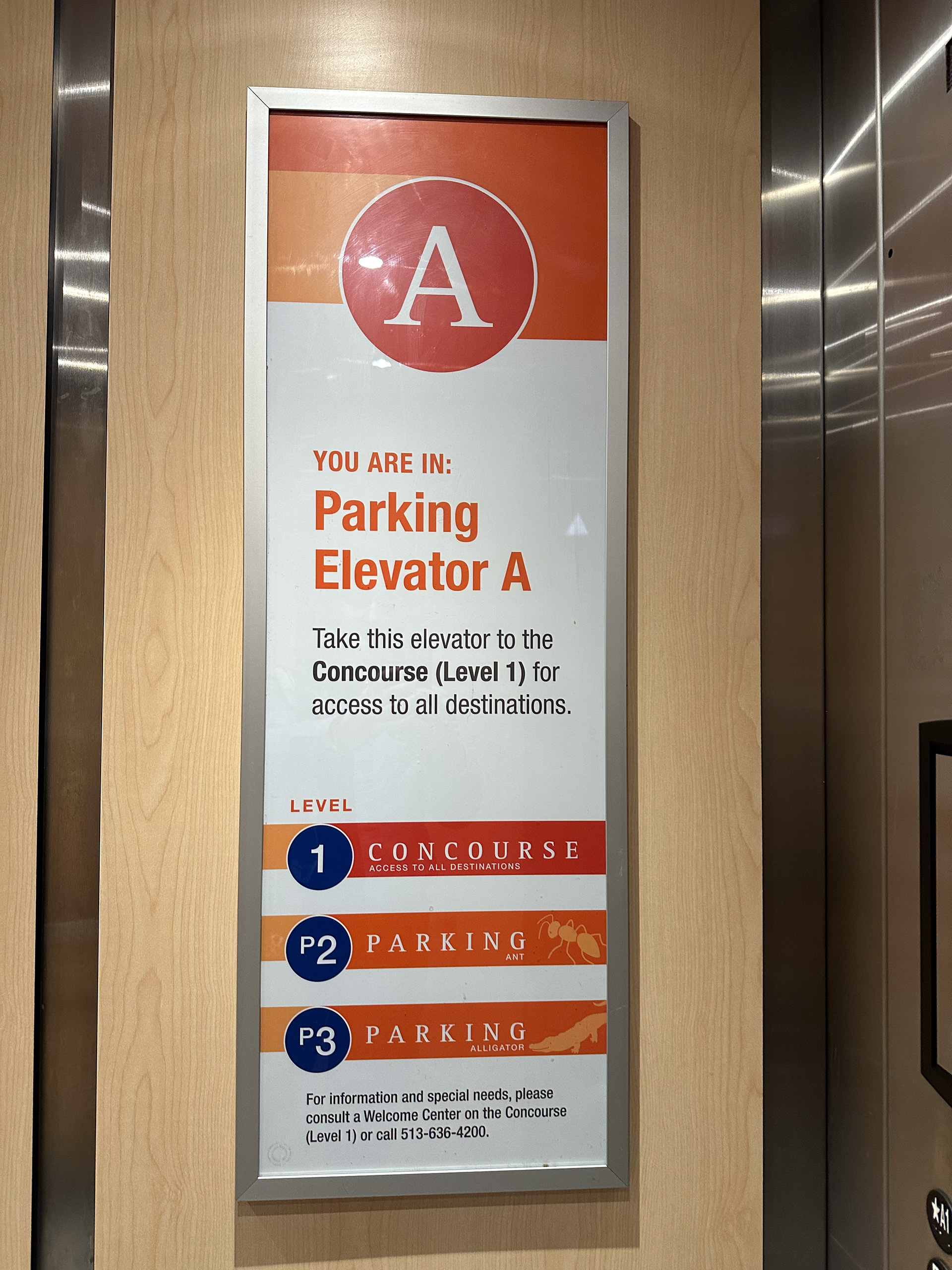
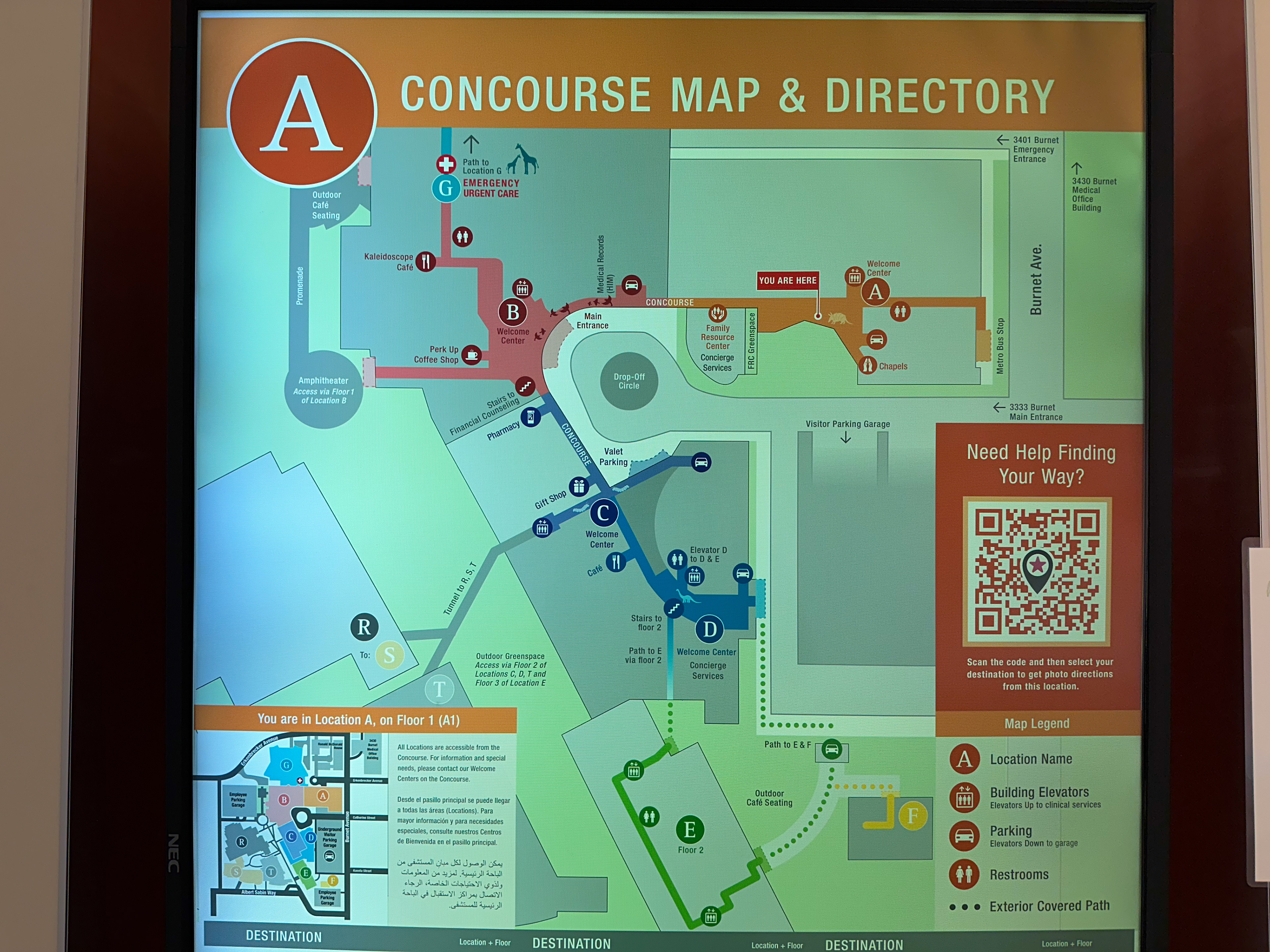
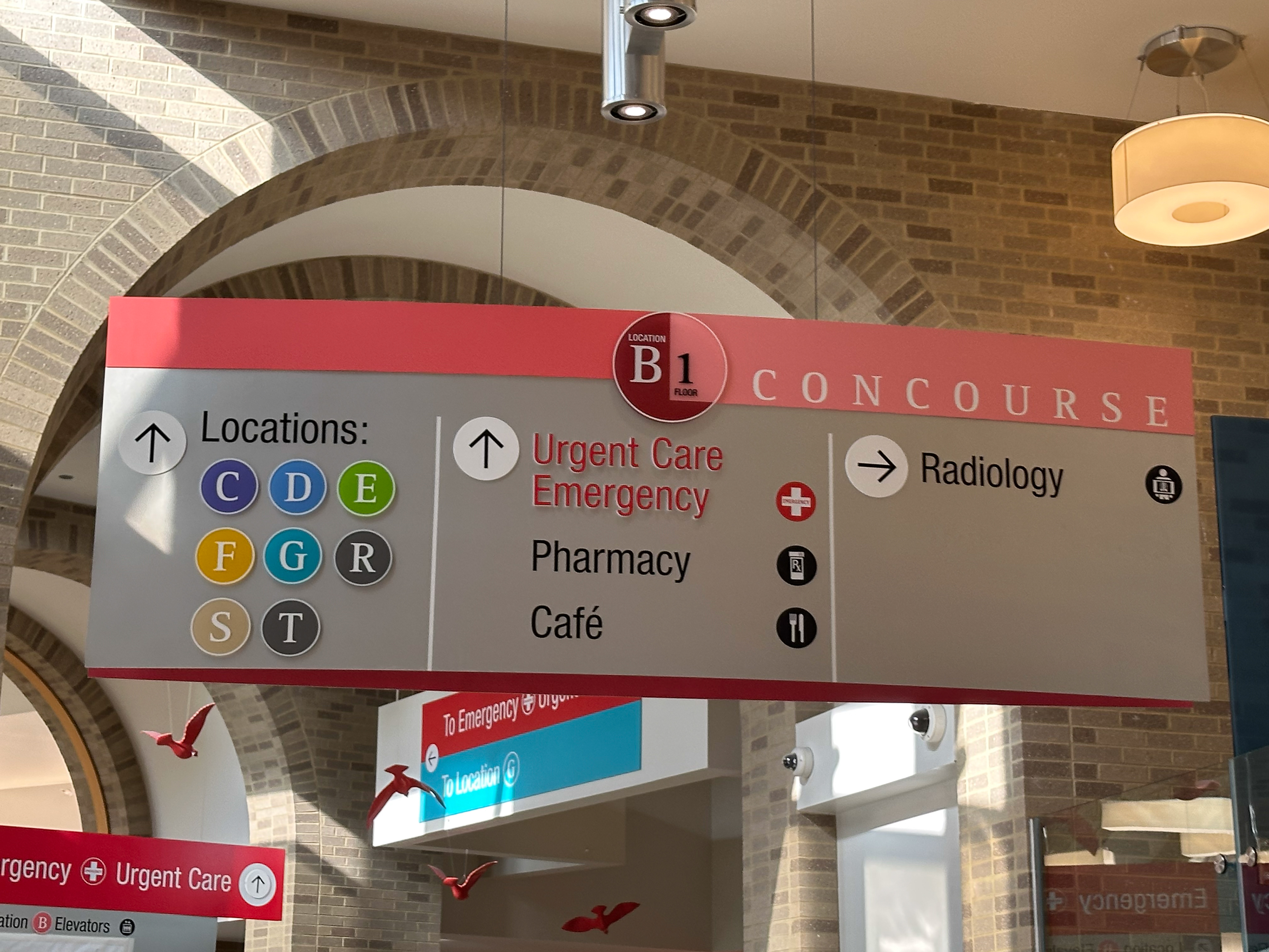
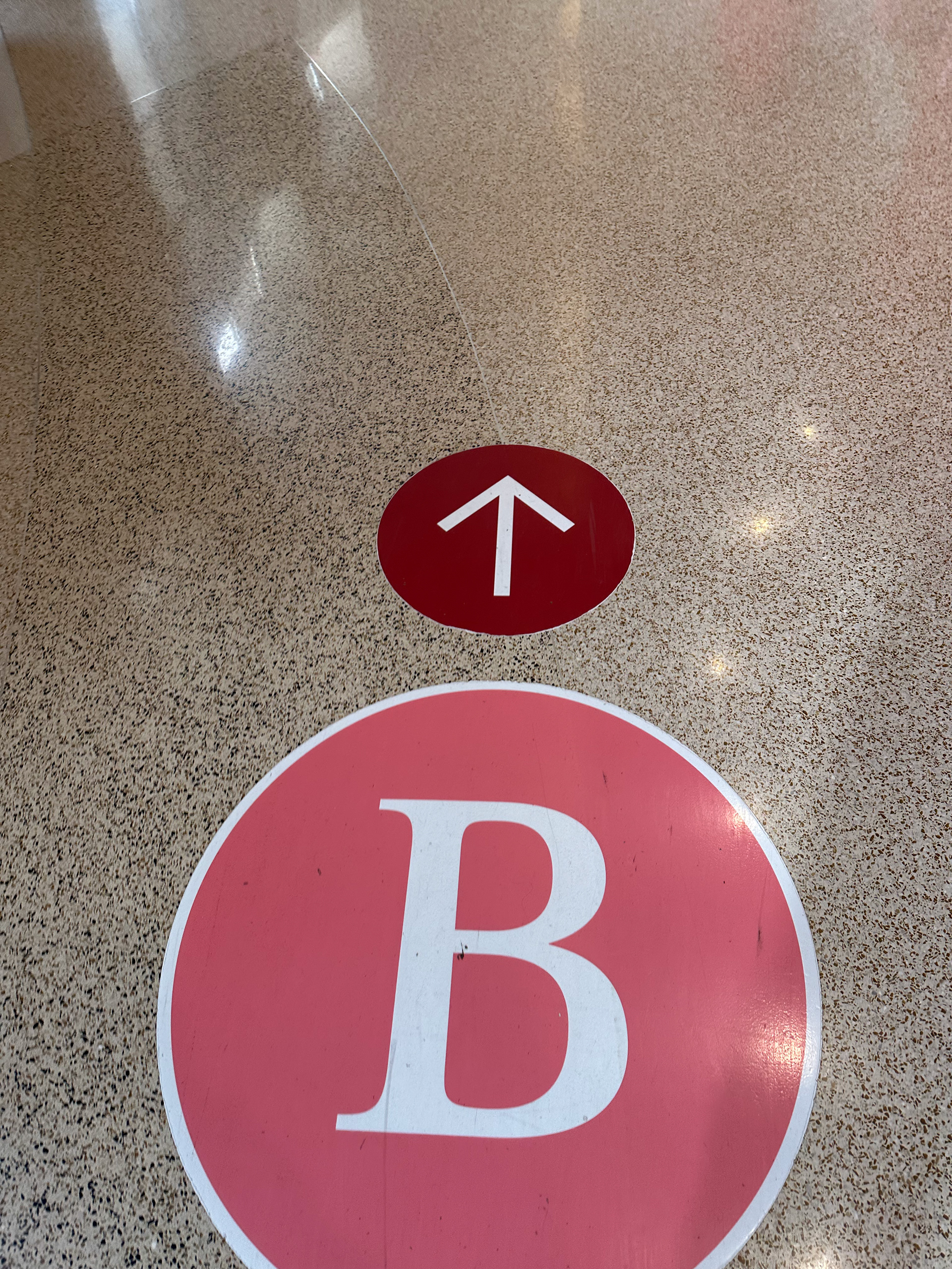
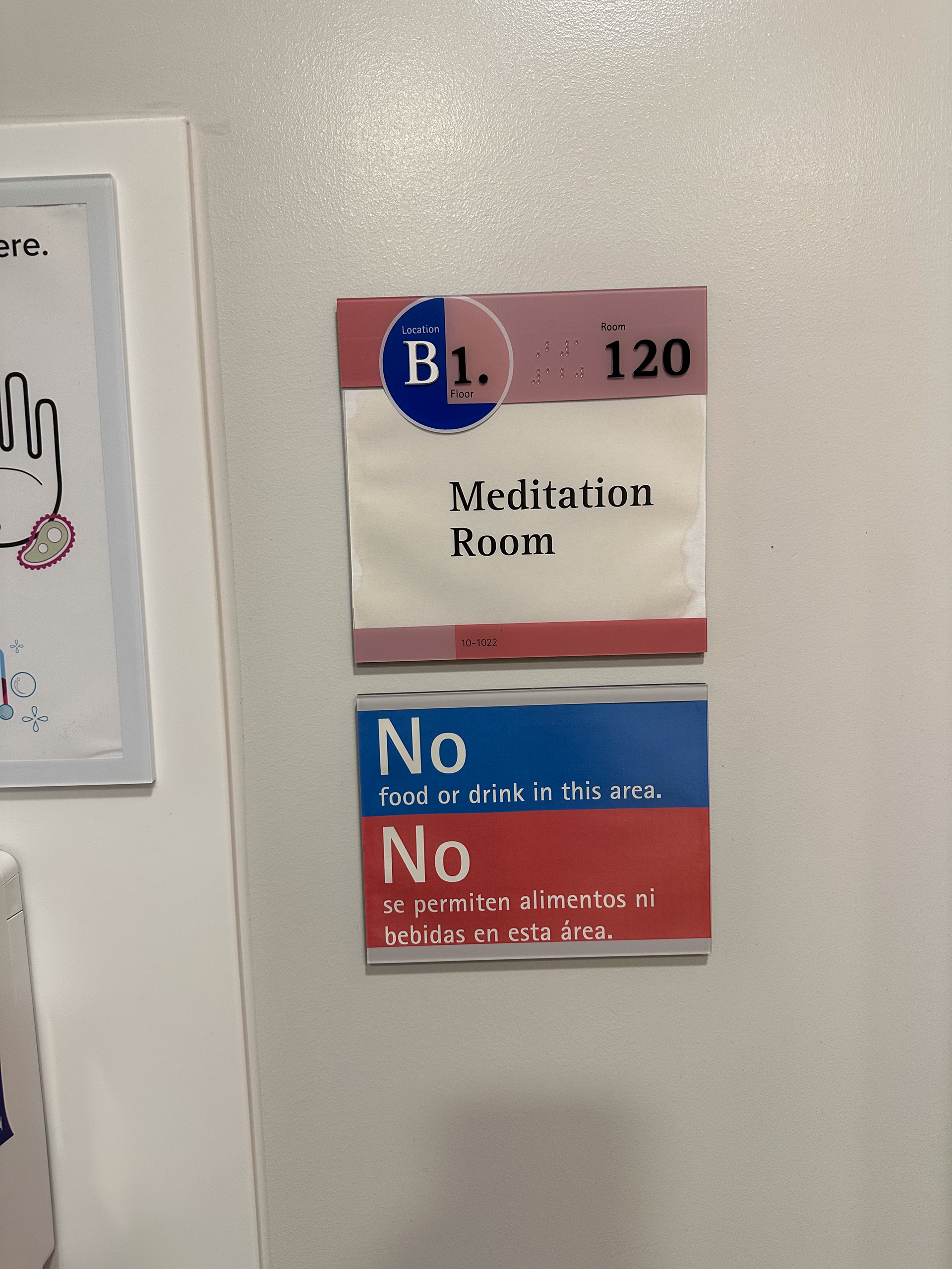
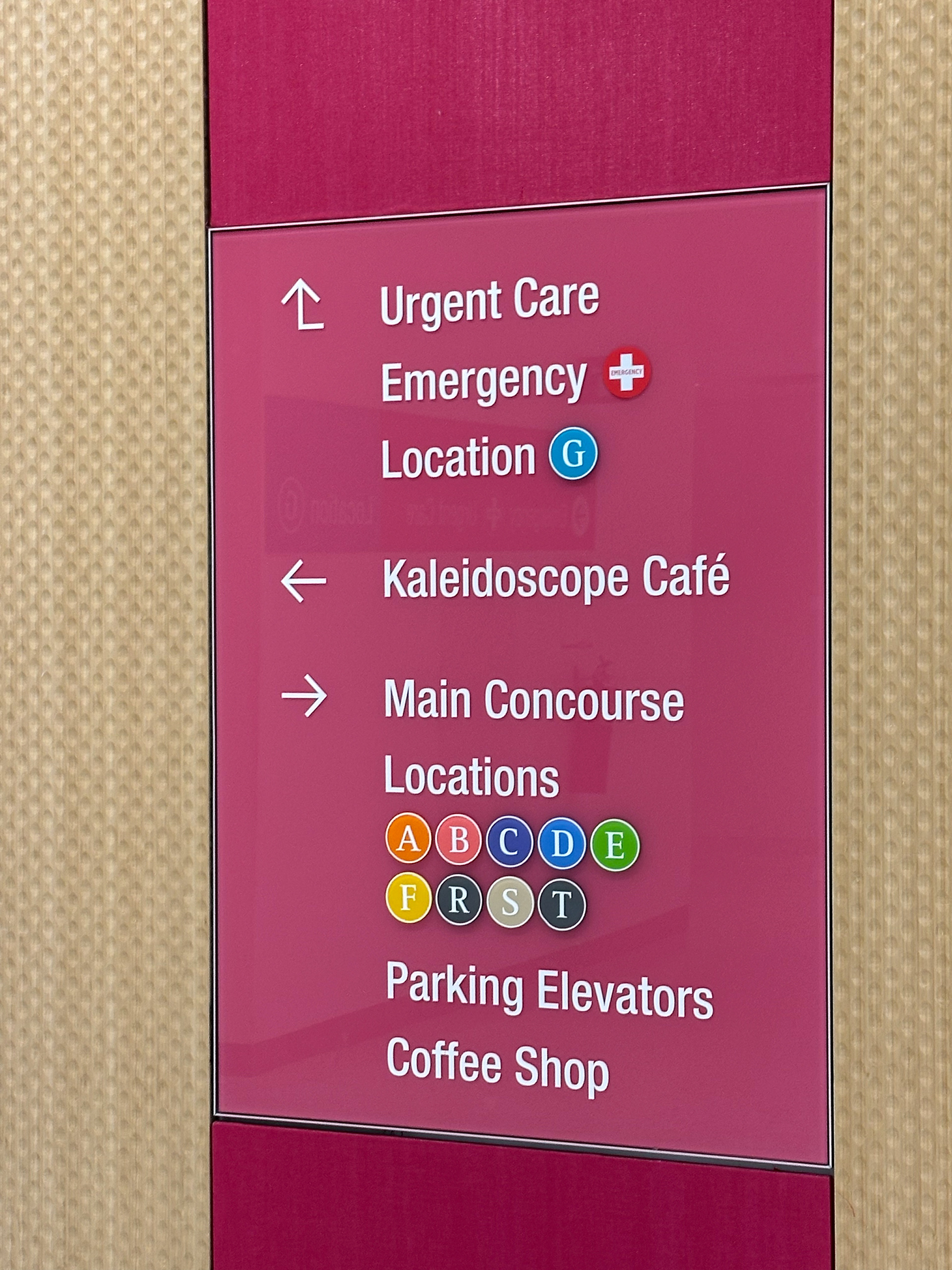
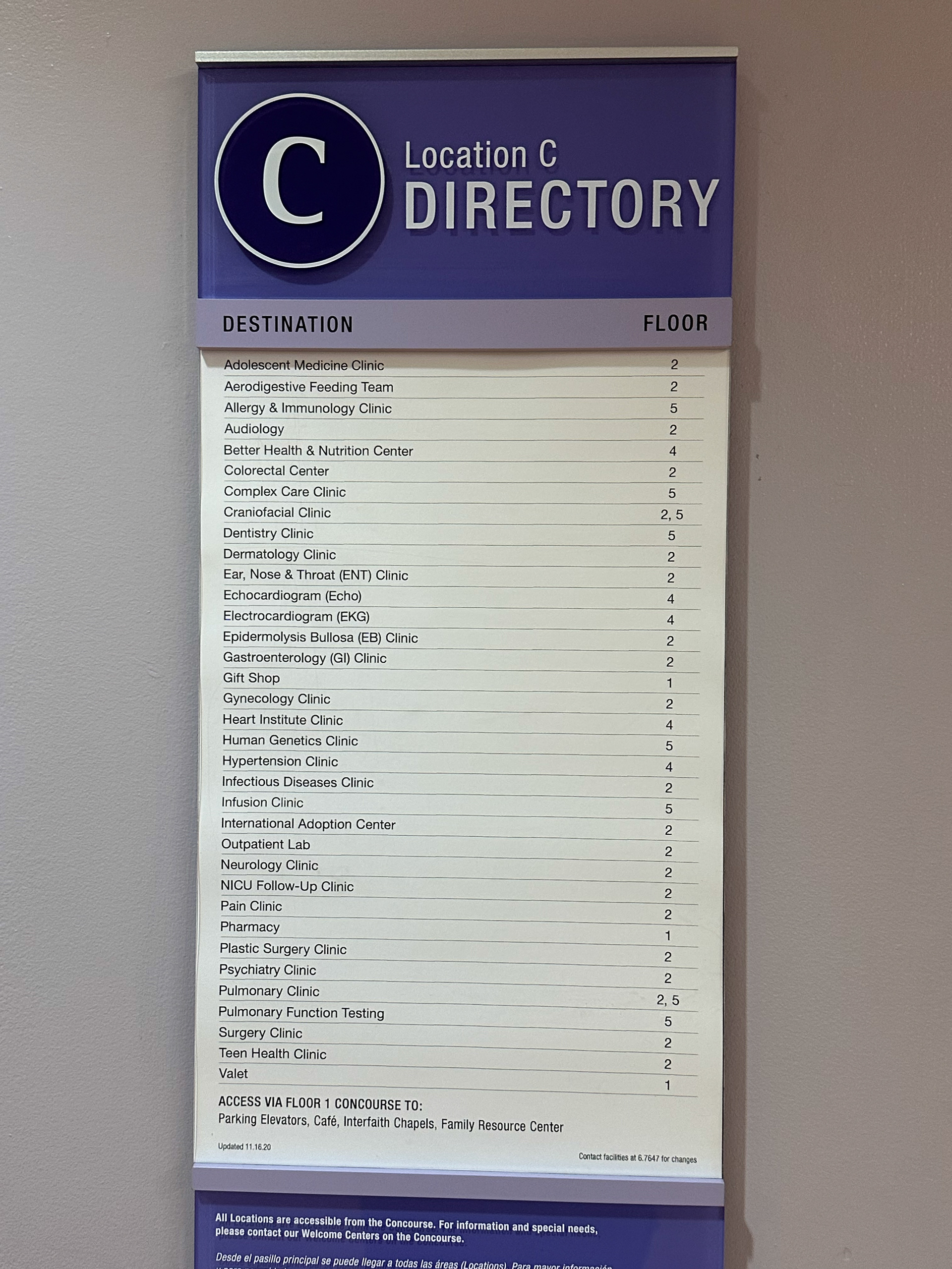
When identifying pain points, I needed additional benchmarking. Children's hospital was a great example as it uses
the perfect balance of color, maps, copywriting, wayfinding, and placemaking. Taking my learnings from my benchmarking,
I continued onto lo-fi iterations.
the perfect balance of color, maps, copywriting, wayfinding, and placemaking. Taking my learnings from my benchmarking,
I continued onto lo-fi iterations.
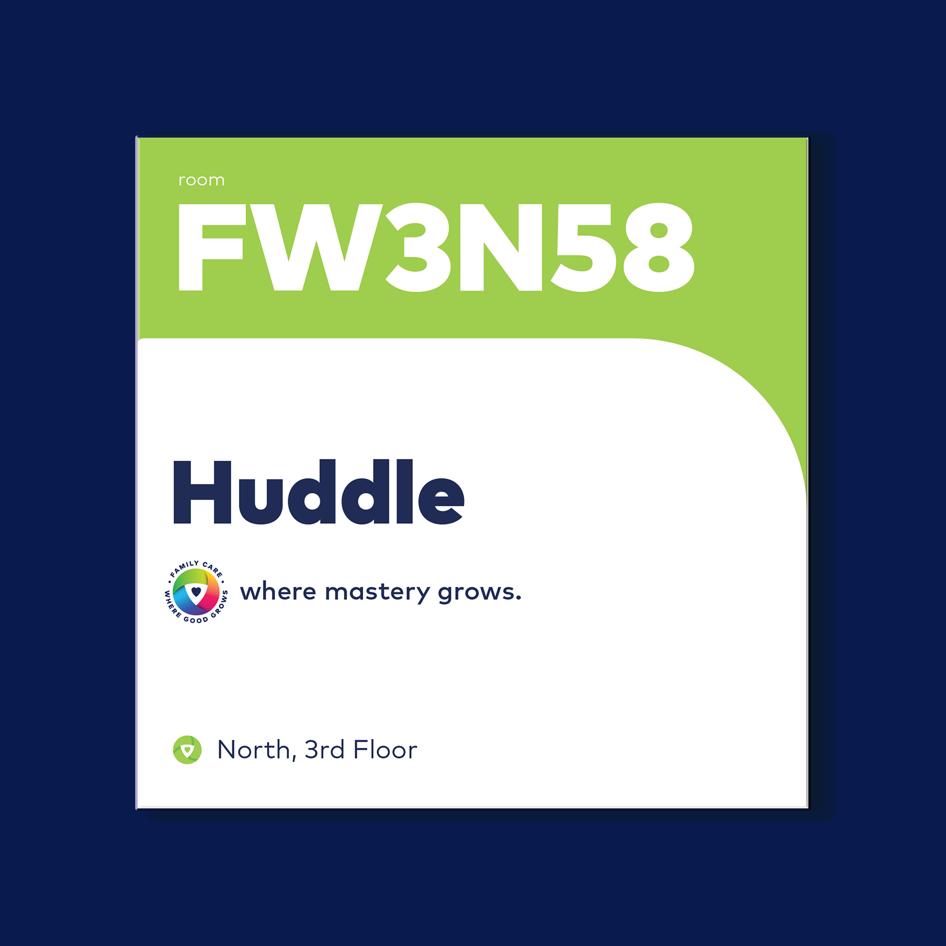
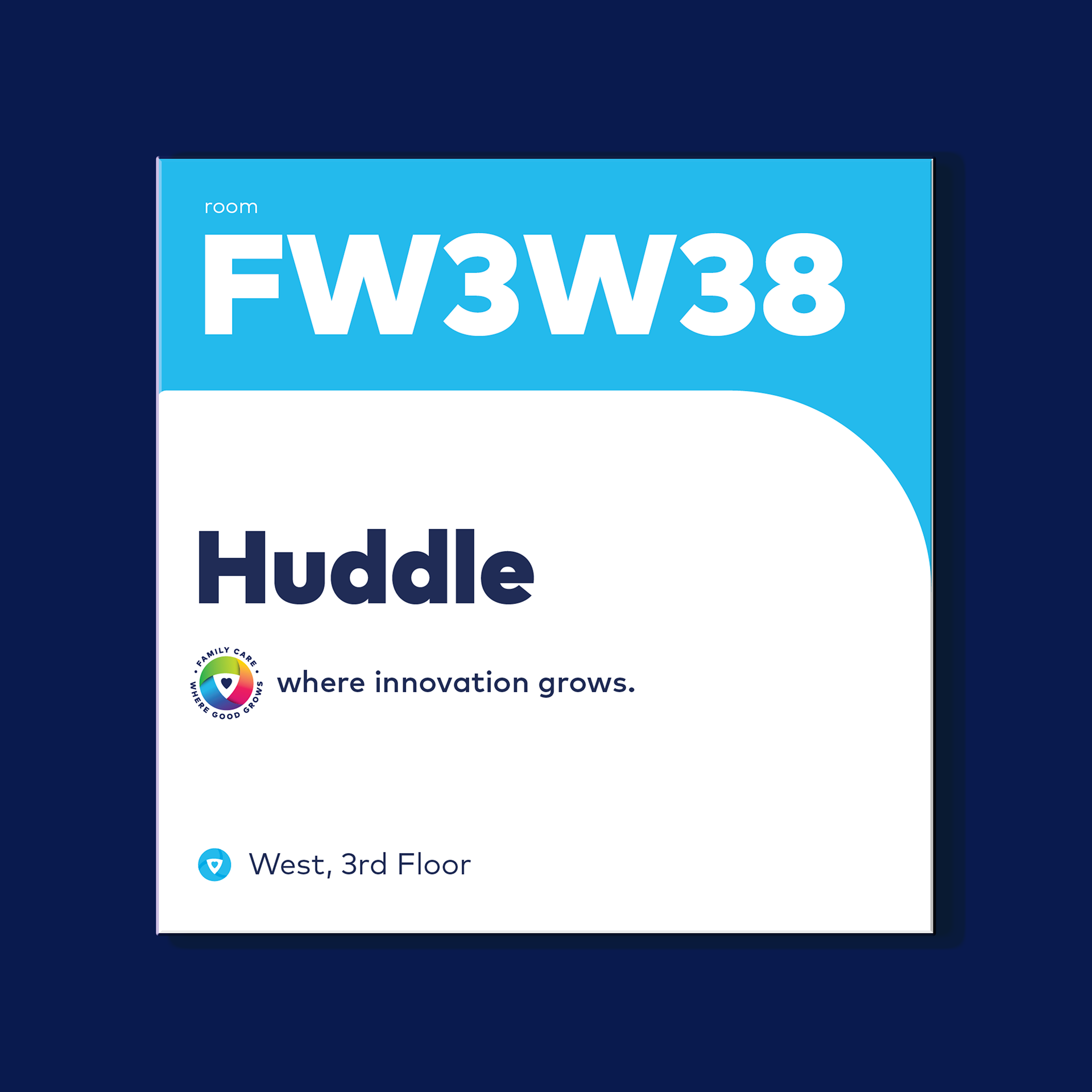
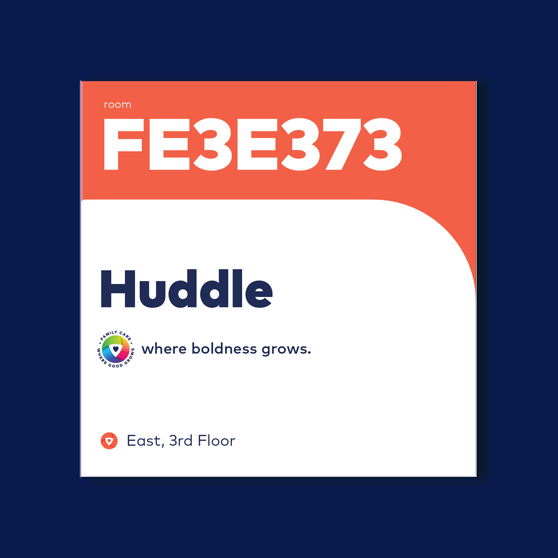
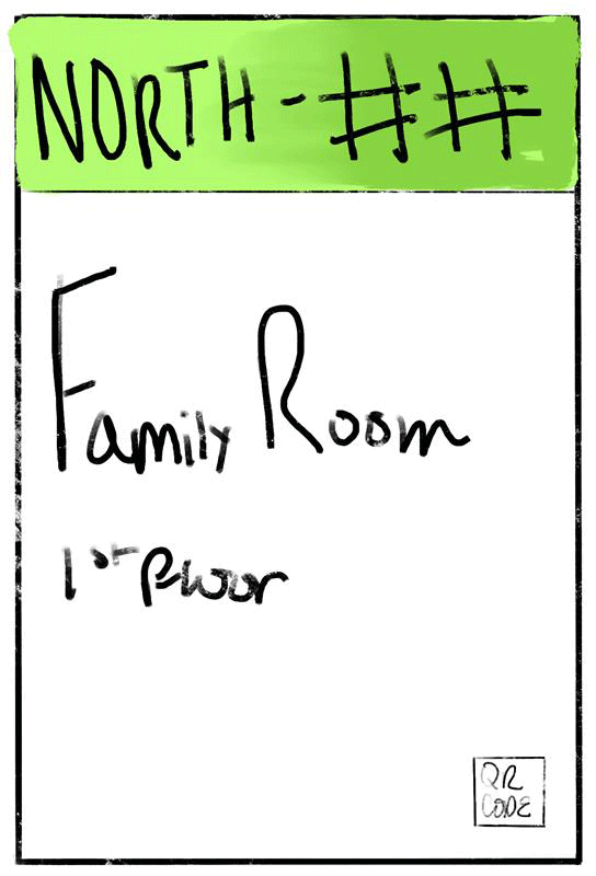
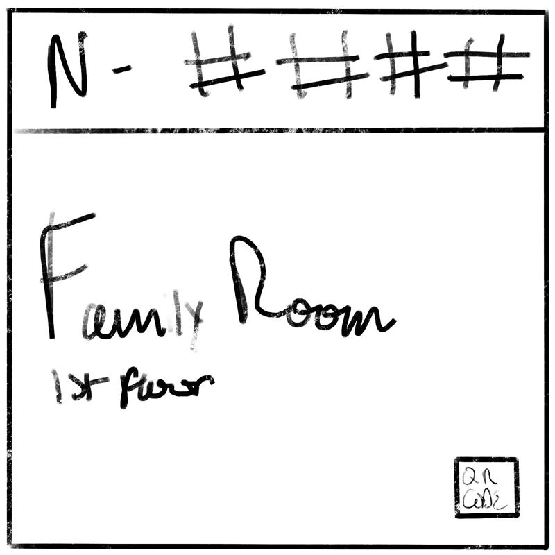
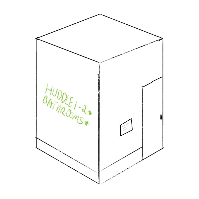
Huddle Room Signage Iteration
Early hierarchal iterations for the huddle rooms. Strategically playing around with arrangement of hierarchy to user test what was valuable when navigating both the east and west buildings.
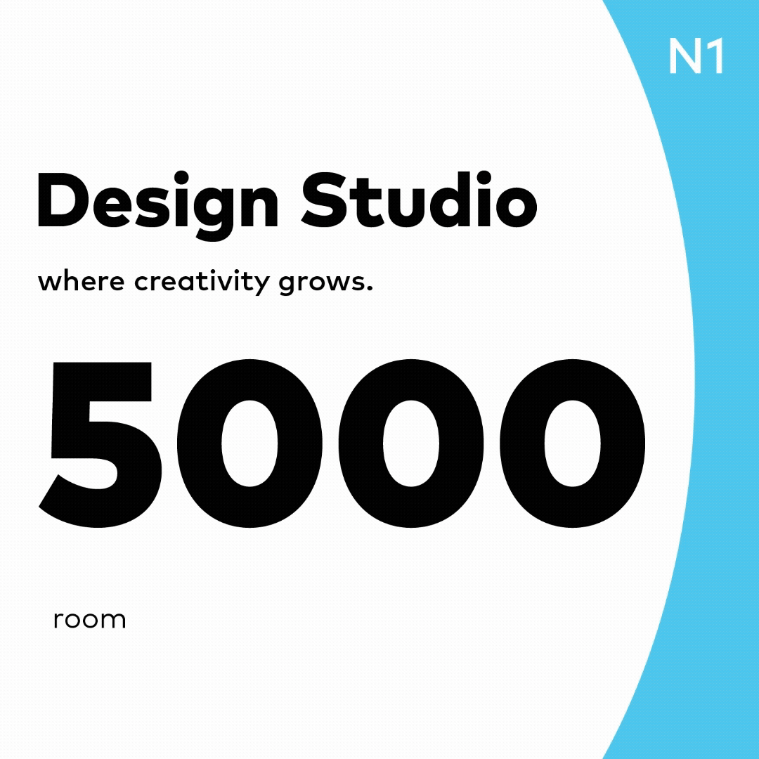
Touchpoint Signage Iteration
Early hierarchal iterations for the touchpoint signage. Strategically playing around with arrangement of hierarchy and system design to user test what was valuable when navigating both the east and west buildings.
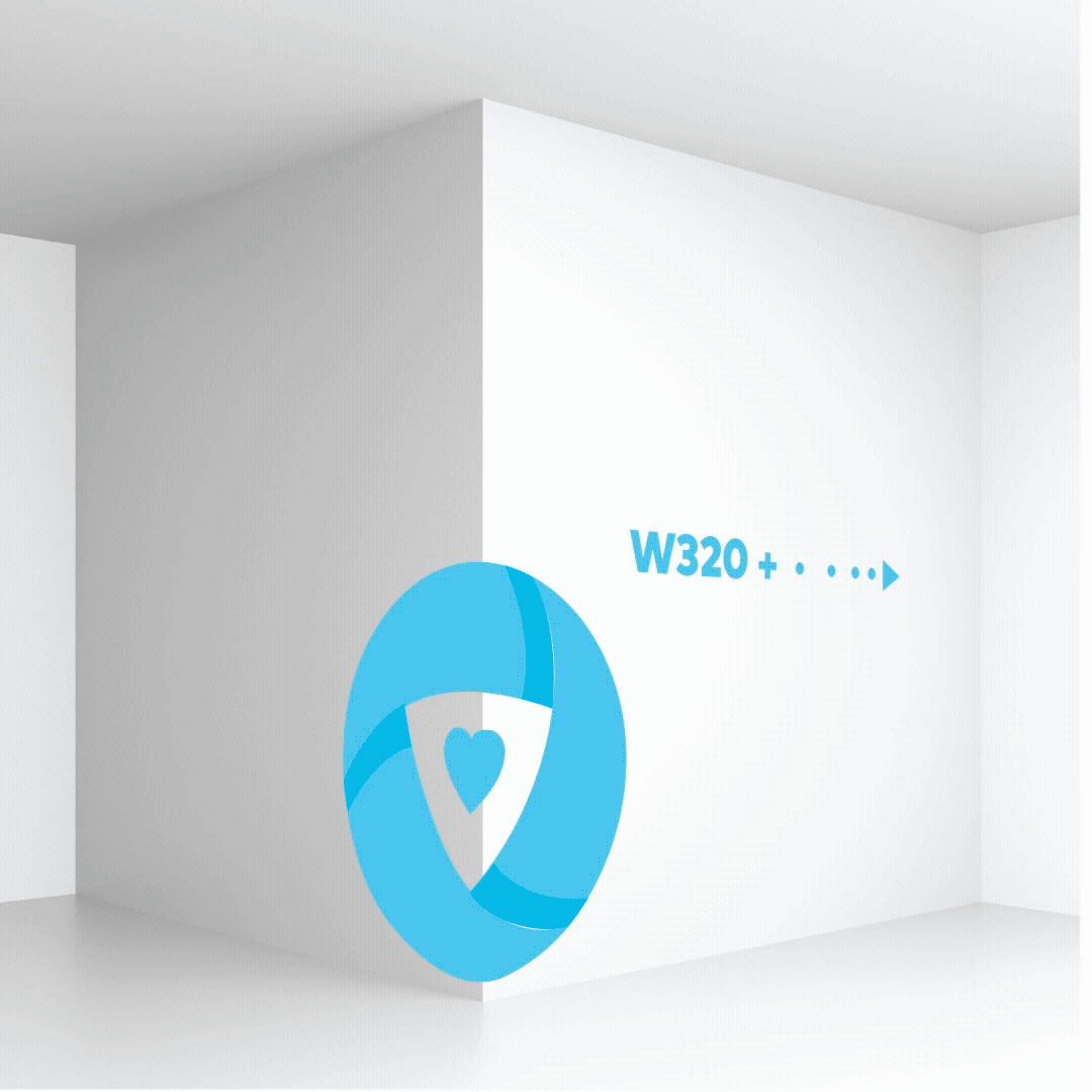
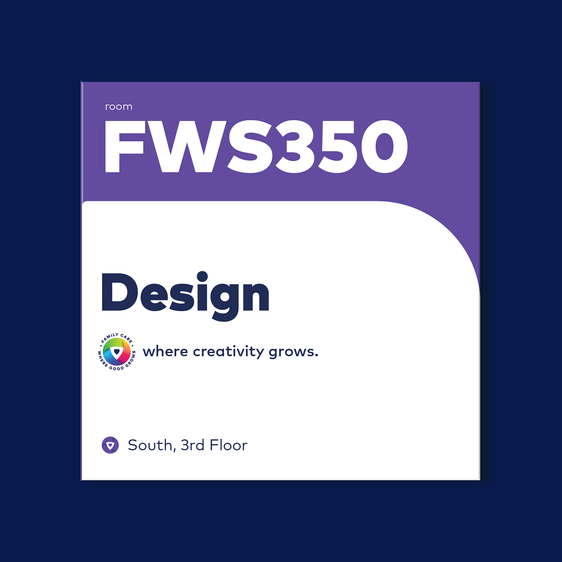
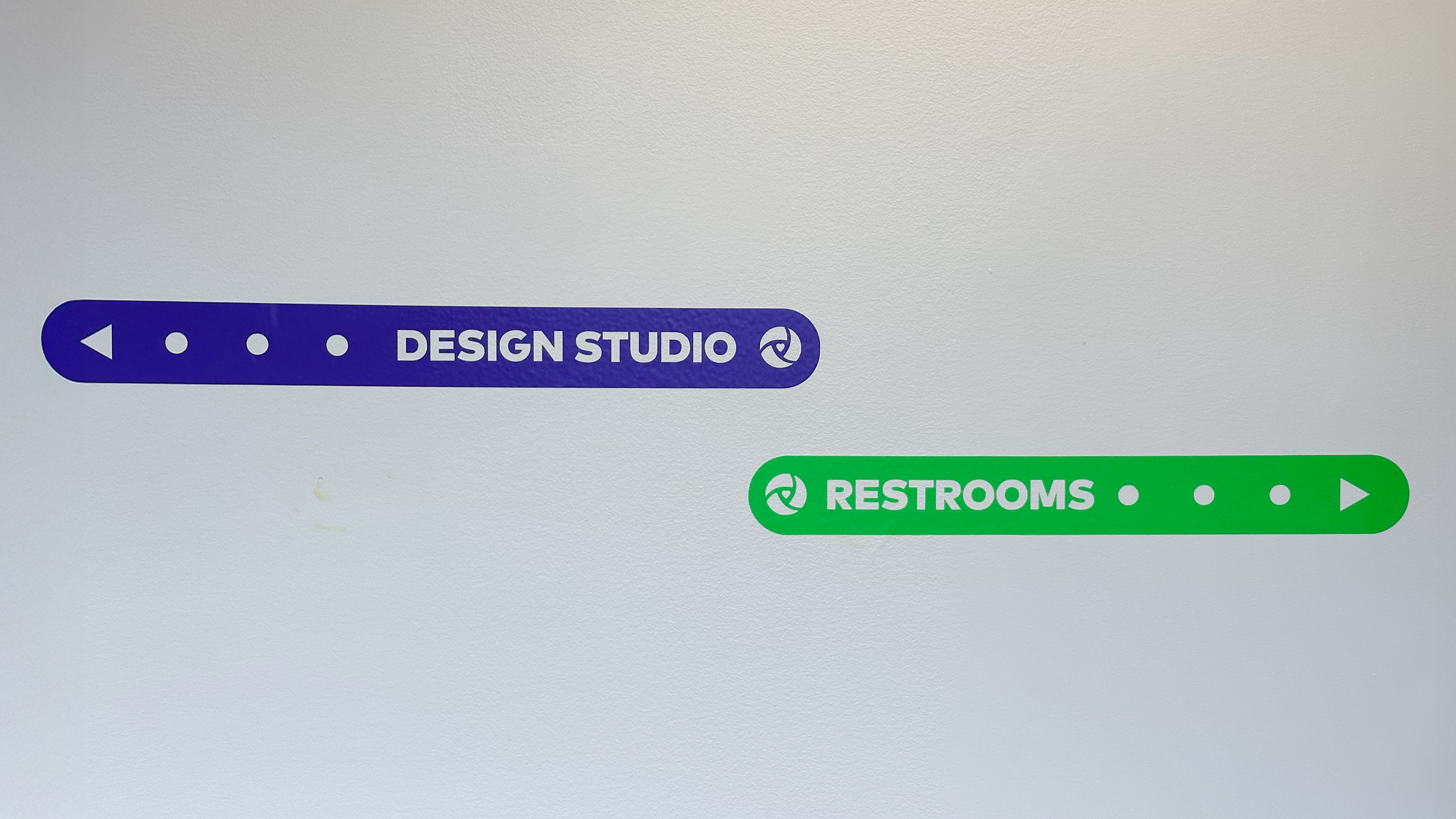
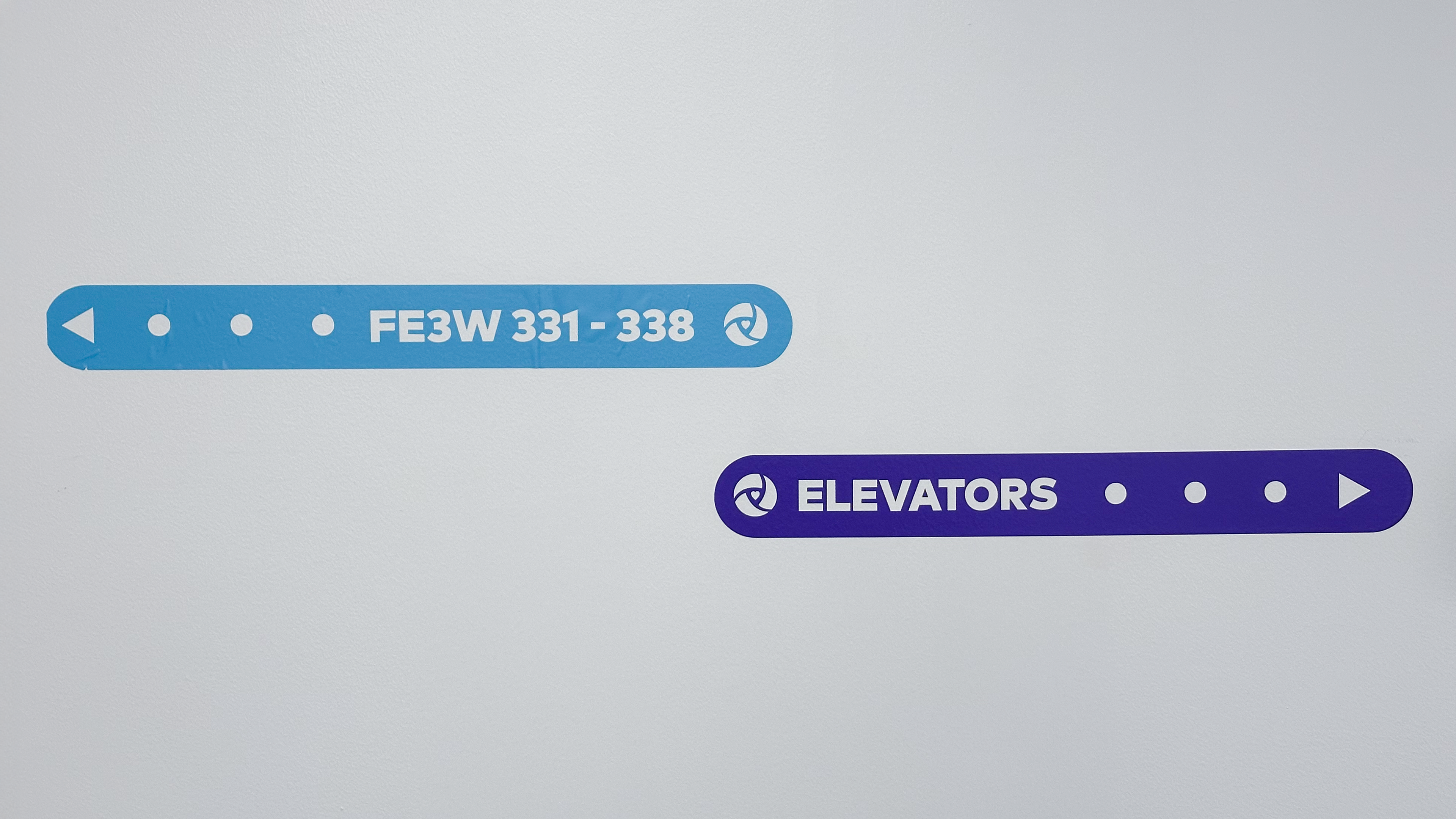
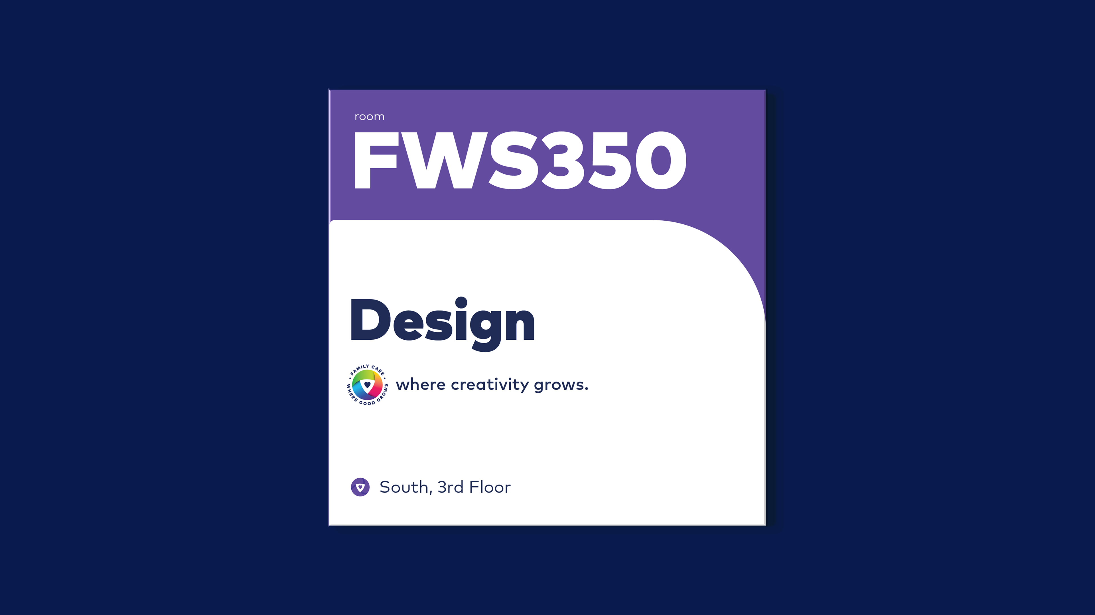
the System design
Using the family care design branding as a compass, each direction has an assigned color. Additionally, each subtext refers to a department within the building, serving as a secondary directional tool.

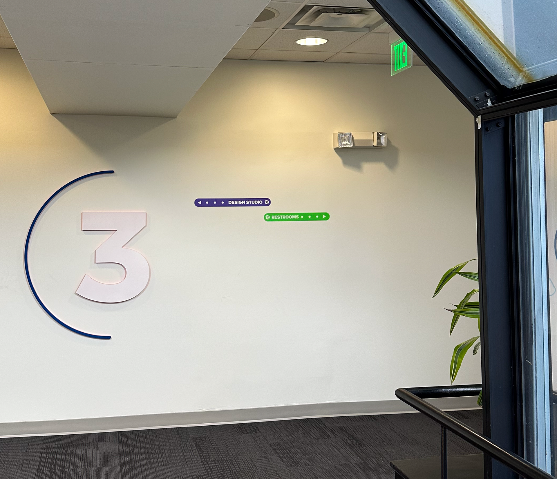
Final Products